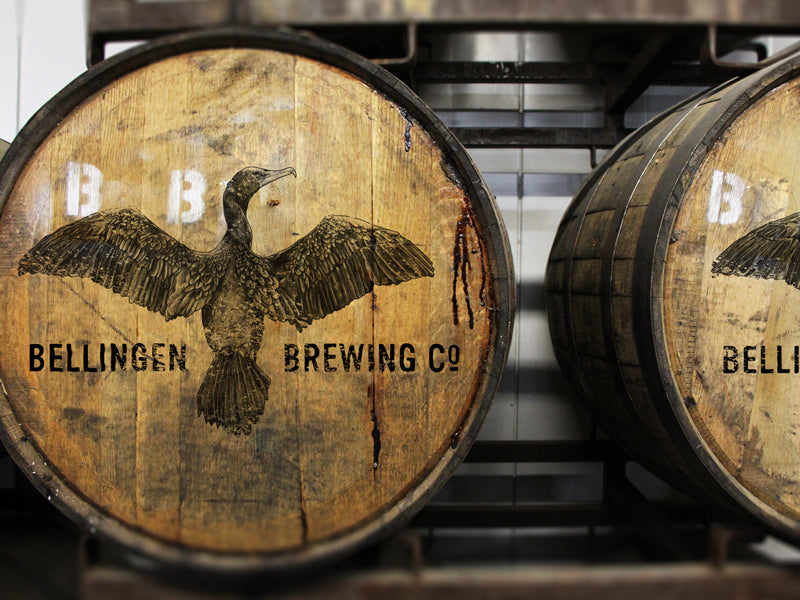
Bellingen Brewing Co. – Visual Identity & Brand Icon Development
When Bellingen Brewing Co. set out to refresh their identity, they wanted more than a logo update — they wanted a visual symbol that truly reflected the spirit of the brewery. The Sound of Breaking Glass – Creative Studio was brought in to shape the creative direction and deliver a refined, versatile brand system.
The centrepiece of the rebrand is the winged cormorant, chosen by the client as a powerful emblem of strength, adaptability, and courage. Originally supplied as a detailed pencil illustration, the cormorant was reimagined and integrated into a new master logo lock-up that would anchor the brewery’s visual identity going forward.
Crafting the Brand System
Our work extended beyond the primary logo to ensure flexibility and consistency across all applications:
- Translating the pencil drawing into a precise, scalable vector illustration
- Producing alternate logo configurations for different contexts and formats
- Designing graphic elements for packaging, print, merchandise, and digital use
- Establishing a cohesive look and feel to unify the brand across every touchpoint
The Result
The evolved identity preserves the authenticity of the client’s vision while delivering the clarity, scalability, and polish needed for a competitive, modern craft brewery. The winged cormorant now stands as a strong, recognisable icon for Bellingen Brewing Co. both in their local community and beyond.
From Local Roots to Global Reach
From our Mid North Coast studio, we collaborate with clients throughout Valla Beach, Coffs Harbour, Nambucca Heads, Scotts Head and surrounding areas — as well as brands across the globe. The Sound of Breaking Glass – Creative Studio delivers branding, packaging, and visual design systems that resonate with audiences both locally and internationally.

